
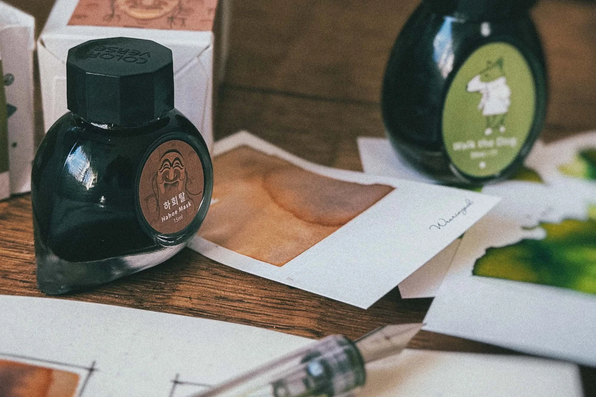
Ink Swatches Lie Sometimes
Big ink swatches are fun.
Let’s get that out of the way first, because I am absolutely not here to pretend I am above them. I like a dramatic ink splodge as much as the next stationery gremlin. Give me a big patch of colour, a bit of shading, some weird chromatography, maybe a suspicious little halo around the edge, and I am interested.
Swatches are useful. They are satisfying. They make ink collections easier to compare. They help you see undertones, saturation, sheen, shimmer, shading, and all the strange little things an ink might do when it is allowed to misbehave on paper.
But they also lie sometimes.
Not maliciously. This is not ink fraud. Nobody needs to launch a parliamentary inquiry into the swatch card community.
But a big dramatic swatch does not always tell you what an ink is going to look like when you actually write with it.
And that matters.
Because most of us are not buying ink so we can paint one huge rectangle in a notebook and then walk away feeling emotionally complete. We are buying ink to write with it. Journal with it. Scribble half-formed thoughts with it. Label things. Test pens. Write letters. Make lists. Pretend we are organised for six minutes.
A swatch shows you what an ink can do.
Writing shows you what an ink actually does.
That is the difference.
The swatch is the loud version
A swatch is usually ink turned all the way up.
More ink. More saturation. More pooling. More paper contact. More drying weirdness. More opportunity for drama.
That can be genuinely useful. A big swatch can reveal parts of an ink that normal writing might only hint at. You might see a green split into yellow and blue. You might see a grey lean purple. You might find a hidden red edge in a brown ink. You might finally understand why an ink looked boring in the bottle but suddenly has swamp goblin energy on paper.
That is good information.
The problem starts when the swatch becomes the whole verdict.
Because a giant soaked patch of ink is not the same thing as a fine nib writing on regular paper. It is not even the same thing as a medium nib writing a journal entry. It is a stress test. A colour sample. A little ink crime scene.
Useful, yes.
Complete, no.
Writing is where the ink has to behave
Writing is less dramatic, but it is usually more honest.
When an ink goes through a fountain pen, it has to do the boring practical stuff. It has to flow. It has to dry. It has to be readable. It has to work with the nib, the feed, the paper, and whatever hand movement you bring to the table.
That is where the personality changes.
The ink that looked deep and complex in a swatch might come out pale and thin in a fine nib.
The ink that looked loud and aggressive in a blob might settle into something surprisingly usable in everyday writing.
The ink that had ridiculous sheen in a heavy swatch might show almost none of it unless you are writing with a firehose nib on coated paper.
The ink that looked beautifully shaded in a dip test might flatten out completely in your actual pen.
None of that means the swatch was useless. It just means the swatch was only one version of the truth.
Paper is part of the lie
Paper makes this even messier.
An ink on Tomoe River, Rhodia, Midori, copy paper, Field Notes, or whatever suspicious notebook you found in a drawer can behave like five different inks pretending to be related.
Some papers show sheen. Some kill it immediately.
Some make shading look beautiful. Some make it look like the pen is running out of ink.
Some papers make a colour look crisp and controlled. Others turn it into feathered nonsense.
So when someone says an ink is dry, wet, dramatic, flat, vibrant, dull, well-behaved, or unusable, the missing question is usually:
On what paper?
Because paper is not just the background. It is part of the test.
A swatch without context is a nice picture. A swatch with paper, nib, and writing notes becomes useful.
Photography makes everything worse
Then there is the extra layer of social media nonsense.
Lighting changes ink.
Editing changes ink.
Phone cameras change ink.
Warm desk lamps, daylight, exposure shifts, filters, contrast tweaks, and whatever Instagram compression decides to do that day can all push an ink away from what it actually looks like in person.
This is not always deliberate. Sometimes the camera just panics and makes a green ink look like radioactive salad dressing. Sometimes a soft grey suddenly looks blue. Sometimes a subtle brown becomes full theatrical mahogany because the lighting had opinions.
That is why I do not fully trust one photo, one swatch, or one dramatic ink sample on its own.
They are useful clues, not final evidence.
My swatch cards are not verdicts
This is why I like building swatch cards that include more than one kind of mark.
The big swatch is there for the drama. It shows the full spread of the ink. The saturation. The edge behaviour. The weird undertones. The part of the ink that makes you go, “Oh, that’s doing something.”
But the writing sample is the reality check.
That is where the ink has to stop performing and start working.
A dip nib line gives one kind of information. A fountain pen gives another. A broad nib tells a different story from a fine nib. A brush or cotton swab gives another one again.
None of them are perfect.
Together, they get closer.
That is the real point. Not to find one perfect testing method, but to stop pretending one test tells the whole story.
Swatches are still worth doing
This is not an argument against swatching.
Swatching is good. Swatching is useful. Swatching is one of the best ways to understand your ink collection, especially once you have enough bottles that “sort of blue, maybe?” stops being a functional filing system.
Swatches help you compare colours quickly. They make patterns visible. They show which inks overlap, which ones fill gaps, and which ones you bought because apparently you needed nine versions of murky green.
No judgement. I am also the problem.
But swatches work best when they are treated as part of the process, not the final answer.
A swatch can tell you whether an ink is interesting.
Writing tells you whether you actually want to use it.
That second part is the one that matters more.
The boring test is usually the useful one
The least exciting ink test is often the most helpful:
Write a few lines.
Use the pen you would actually use.
Use the paper you actually write on.
Let it dry.
Look at it later.
That is where you find out whether the ink belongs in your rotation or just looks good on a card.
Some inks are excellent performers and terrible show-offs. Some inks are beautiful in swatches and annoying in use. Some are quiet, useful, dependable, and never going to win the internet’s attention because they do not explode into twelve colours under a desk lamp.
That does not make them worse.
It just makes them honest.
Final thought
Ink swatches lie sometimes.
Not because they are bad, but because they are loud. They show the dramatic version. The overfed version. The version of the ink with its jacket off, standing on a table, making questionable decisions.
Writing is quieter.
Writing is where the ink has to prove it can live on the page.
So swatch the ink. Absolutely. Make the big dramatic card. Enjoy the weird edges and the colour shifts and the little puddles of chaos.
But do not stop there.
Write with it.
That is where the truth usually shows up.